Timeline:
Feb — Mar 2018
Role:
Product Designer
Platform:
Mobile
Team:
Solo Designer
SeeAround.me is an iOS mobile app that brings community-generated, hyperlocal news to Bay Area users. Prior to this project, a team of 5 designers (including me) improved the app’s UX and branding. Happy with the result, the client approached me with hopes to work on a redesign of the secondary newsfeed dubbed “Map View”, where a user should be able to view hyperlocal news from a location perspective.
I explored the reconfiguration of the existing information architecture, bringing a tighter format for content and interaction to support branding.
The client was satisfied with my take and planned to push it to his development team ASAP.

A solo project
The client approached me to reconfigure another critical piece of his app, SeeAround.me: the “Map View”.
The goal was to provide users with a more visual, location-oriented method of discovering relatable, hyperlocal news.
The primary newsfeed was similar the likes of Reddit and news apps that use infinite scrolling to provide a continuous stream of information and news, but this Map View would function as another alternative way to view news if users would prefer to view news pertaining to their current location.
I explored the reconfiguration of the existing information architecture, bringing a tighter format for content and interaction to support branding.
WHAT IS SEEAROUND.ME?
Hyperlocal news for the Bay
SeeAround.me is an iOS mobile app that brings community-generated, hyperlocal news to Bay Area users.
The problem
The purpose of Map View is to help users visually filter their news based on their GPS location, in real-time.
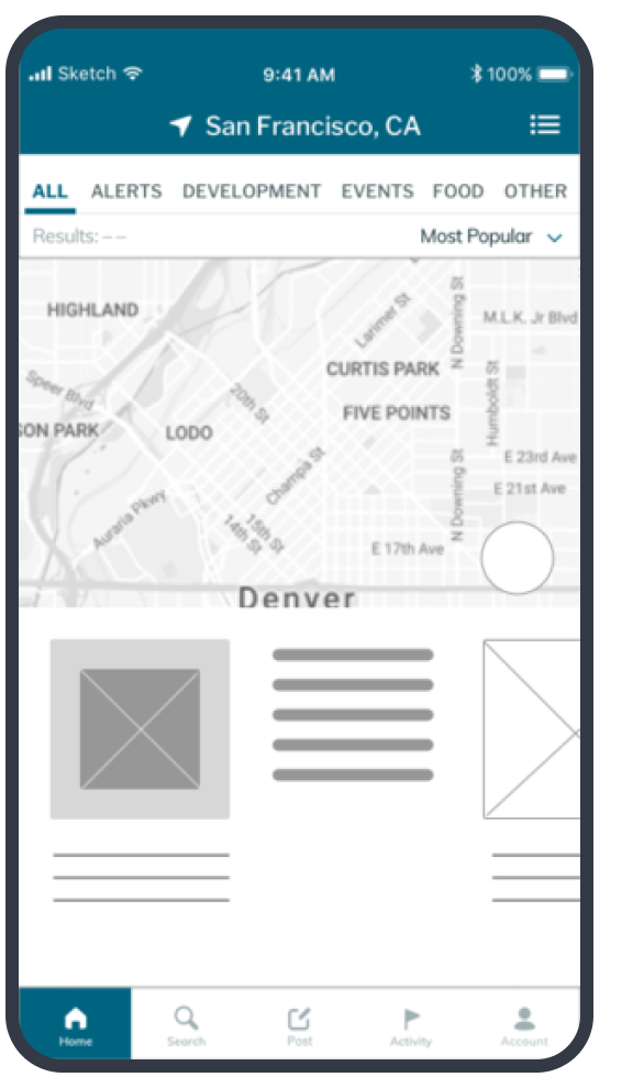
The primary problem was figuring out how to reconfigure news from the primary newsfeed – "List View" (left) – to fit and work in the alternative newsfeed – "Map View".
The original Map View screens (right) had workable design concepts in place, but they were unusable after the team's recent re-skin and suffered from some missing elements, such as a GPS location dot.
The redesigned newsfeed, from a previous project.
The original secondary newsfeed that needs work, aka Map View.
the goal
Content readability is top priority across the board, but content had to play nice with a responsive map in Map View.
The high number of interactions and functions that happen within a mobile platform made for a fun challenge.
Pen to Paper
Within List View, every post is represented as if a card. For the sake of brand continuity, I chose to cross-pollinate and bring that concept over to Map View.
I opened a notebook to roughly cycle through different ways of laying out information within a smaller space. By scribbling out wireframes and simplistic task flows, I visualized different ideas rapidly and objectively.
These were the things to keep in mind while developing lo-fi:
The content must be categorized.
Headline and body text need to keep character count in mind.
Location should show on the card in some small but visible way.
A time stamp is crucial because of the "Most Recent" filter functionality.
Icons take up a big real estate and aren't always the most intuitive way to inform a user of function.
Low-Fidelity Explorations
The different card formats I explored were:
small sized cards
medium sized cards
stacked cards
compressed list view (long and narrow)
Content Representation
There are three types of content that I represented in my high-fidelity mocks:
Text Only
(User only submits written text)
Original Photo
(User uploads his/her own image)
Embedded News
(Shared by URL from third party)
Search
I also explored how the screen might look when a user is searching keywords. In Map View, users need an easy and seamless way to search individual keywords and manipulate them as needed.
Exploring modals in Map View.
The current Search functionality takes up an entire page. As a team, we hadn’t considered how we would handle recently searched keywords and display them as filters. We had yet to think of a way to change or delete keywords.
First, I explored modals. Utilitarian and functional, modals are clear and simple. My goal was that the user would feel as if in the same “place” within the app. A modal layers over the current screen. However, I ultimately decided to go with smaller components – with the card format, modals are one layer too many.
Combining familiarity with space cognizance
Search bars and the search icon are universally recognized. By implementing a thin search bar and pixel-efficient keywords that can be individually deleted and added, the user can stay in Map View and maneuver through it without cumbersome components in the way of primary functions.
Bringing the brand to life
The best thing about mobile Map View is the ability to layer on interactive elements that emphasize a product's value proposition or brand. For example, could bookmarking be accomplished through a swipe down? Or an upvote through swiping up?
These were some of the interaction-related ideas I suggested to the client:
The Result
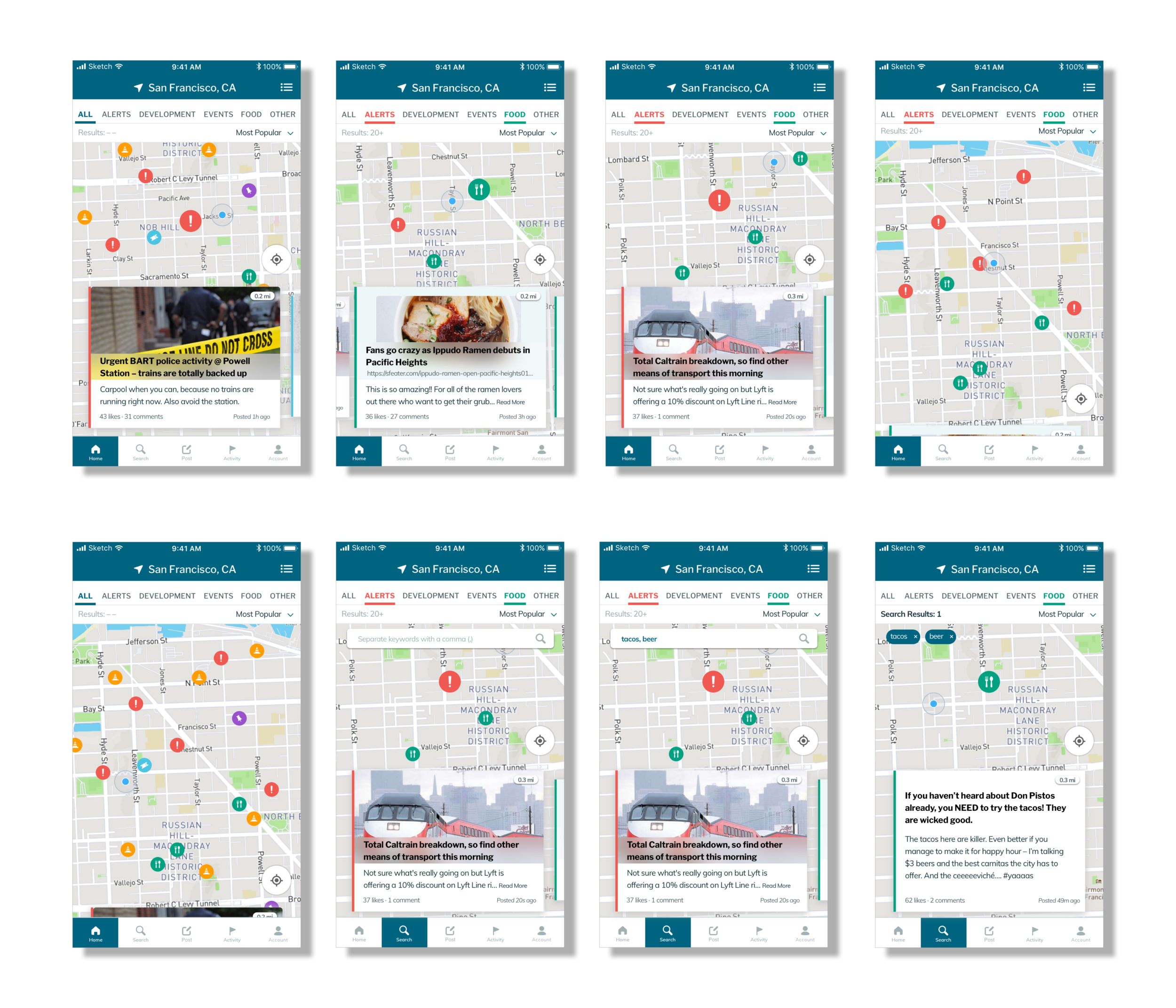
A new experience that affords users a seamless transition between List and Map View.
Users had universal filters, a responsive map, scannable news, and unique search function to utilize.
Same Content, Different Look
Content is organized in a readable way, with proper content hierarchy and retained access to important secondary information (e.g. likes, comments,bookmarked status, and time stamp).
Nested Search
The search bar familiarly appears near the top of the screen after tapping Search tab in the navigation bar. Keywords can be easily manipulated by tapping "X" to delete individual words, and the number of specifically search results also show up above the keywords.

Conclusion
Having complete control over a project was immensely challenging, exciting, and revealing.
I was empowered by the flexibility of rapidly jumping from one idea to the next. While finalizing design decisions was harder without a team to collaborate with, I developed greater confidence in my designs. The client expressed satisfaction with my route, but I find myself acutely curious about what other directions Map View could have taken under different or more designers!
+
Learnings
The biggest takeaways from this project are:
Stronger knowledge of prototyping tools like Framer or Principle would have benefited in demonstrating my final product more powerfully to the client
Collaboration lends power to design thinking and decision-making that can only go so far when designing and working alone.

Want to learn more about my time at Tradecraft?
Other companies I worked at:
Flexport
I joined Flexport’s Freight Operations organization as a senior designer in June 2022. My two featured projects helped supply chain operators transition to a new internal tool in the making.
RAISE CRE BROKERAGE
I joined Raise in August 2019 as their third designer and redesigned how Raise’s commercial real estate brokers collaborate with their clients.


